 Today in FA3000, Design for the Web, we talked about general principles of design. It was nice to see references to research – know your audience, what they want, how they use computers and the web – and to functionalism – know the purpose of your web site and work to meet it for your intended audience. Both very refreshing. But what was really nice was having a quick (about 10 minutes each) overview of design, especially color theory and typography.
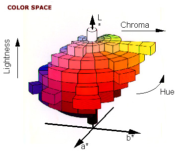
I took a color theory class back when I was an undergraduate Industrial Design student at BYU back in 1985. (That coincided with the time when I generally didn't go to my classes, so things didn't go quite as well as one would have hoped. Oops.) Nevertheless, I had my color cards and I could talk harmonies at least for a little while. I may not have my Pantone stack anymore, but I did have an interesting déjà vu experience last year while attending a conference on computer science, of all things. Actually, it wasn't so shocking because it was VisWeek, the data visualization conference (which was, conveniently, in Salt Lake City last year) and so there was, in fact, a big turn out for the talk on color theory. I learned all about the differences between RGB and CMYK color systems (basically, screens vs. print) and the incompatibilities that exist between them. The speaker... oh, wait! I took the notes on my computer! Let me look them up... Ah, the speaker was Theresa-Marie Rhyne and her personal web page is called Theresa-Marie Rhyne's Viewpoint (and it's at http://web.me.com/tmrhyne/Theresa-Marie_Rhynes_Viewpoint/Welcome.html, at least until Apple shuts down MobileMe next year). She talked about RGB and CMYK, as well as the Munsell system (which I believe is the basis of the HSB – Hue, Saturation, and Brightness – model, although Munsell used the terms Hue, Value, and Chroma; and in which the color orange did not exist, just "red-yellow"), and the Pantone system. (I also just looked up Munsell in Wikipedia and found a huge number of color systems; more systematic coverage is at the article "List of color spaces and their uses".)
Okay, so lots of color theory available. Here are several online color tools mentioned by Martin (my FA2000 and FA3000 teacher – Hi, Martin!), Theresa-Marie, or things I found on my own:
- Adobe's Kuler (Not surprisingly, well-integrated with the Adobe Creative Suite)
- Color Scheme Designer. (This makes hex codes a little easier to get at, which is nice.)
- Colorbrewer focuses on maps
- AVIVADirectory.com (something I just found online, which bills itself as "The Canonical List of Online Color Resources for Designers")
I also have some nifty color apps on my iPod Touch:
And there's a lot to say about fonts, too, but it's late and I'm getting tired. For right now, I'll just mention a few other apps I have that are wonderful:
Lovely stuff. By the way, I just found out that Steve Jobs is stepping down as CEO of Apple (although he IS staying on as Chairman). Who knows what that will mean for the Apple faithful like me. We'll see.