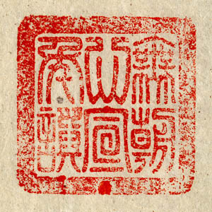
Okay, for my Computers and the Arts class (FA2000) we needed to design a personal logo. My first thought was to model something after a Chinese chop or seal, like one of these:

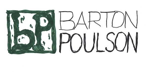
So, here’s my not-very-impressive attemp at a first draft in my favorite color:
So, hand drawn with Sharpies and, given that I couldn’t even draw it straight, a fair amount of freestyle warping in Photoshop. I kind of the the inverted symmetry between the lowercase "b" and the uppercase "P." Also, the whole ends up rather looking for like a child's alphabet blocks:
Anyhow, that’s the first take. We'll see what happens next.

